
Visualizing data through graphs makes information easier to understand and analyze. Simple data representation techniques, such as bar graphs and pie charts, help to clearly display patterns and relationships within datasets. Explore our Simple Data Representation with Graphing Worksheet to practice creating and interpreting various types of graphs.
Bar Graph Worksheets for Categorizing Data
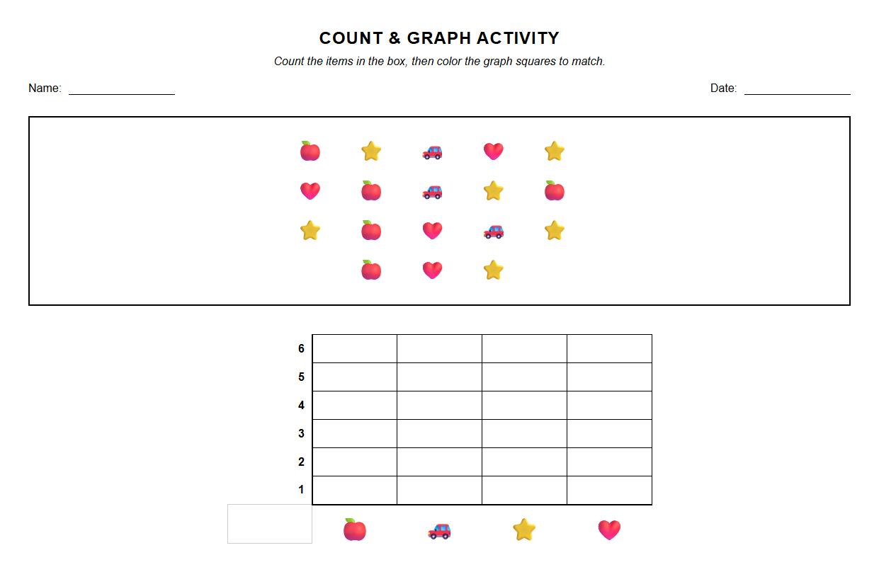


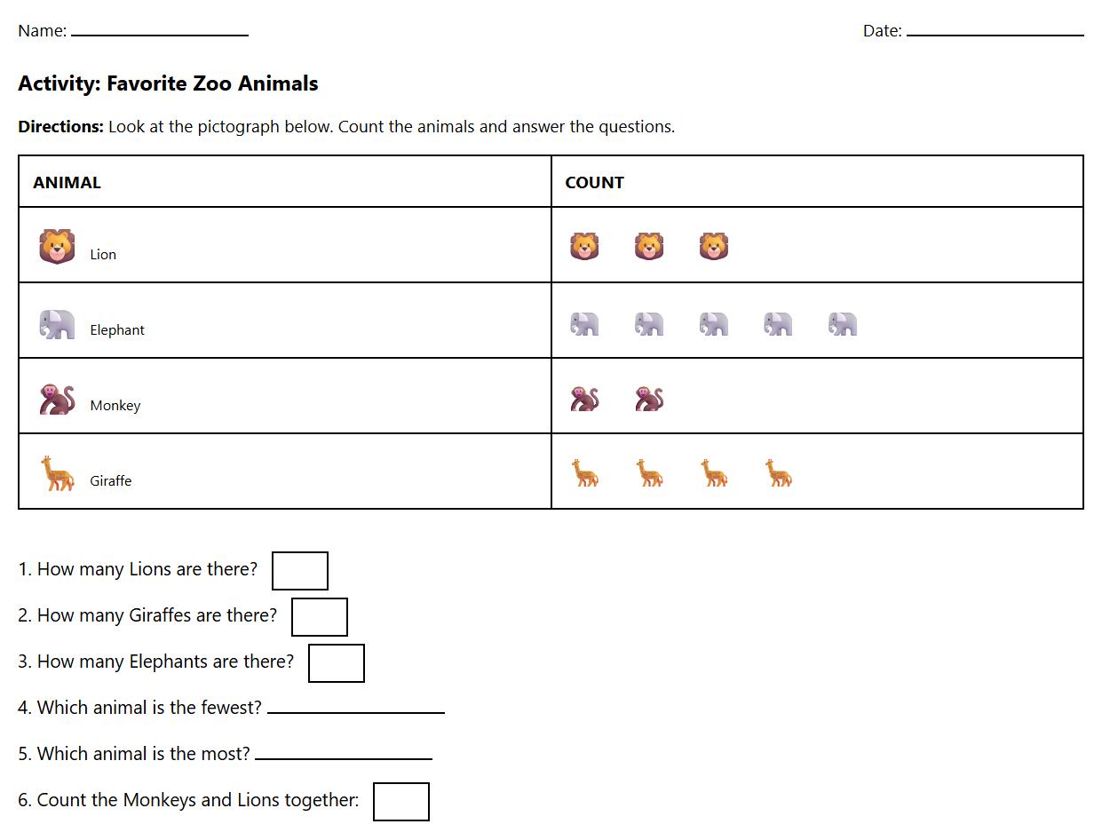
Pictograph Worksheets for Early Data Interpretation

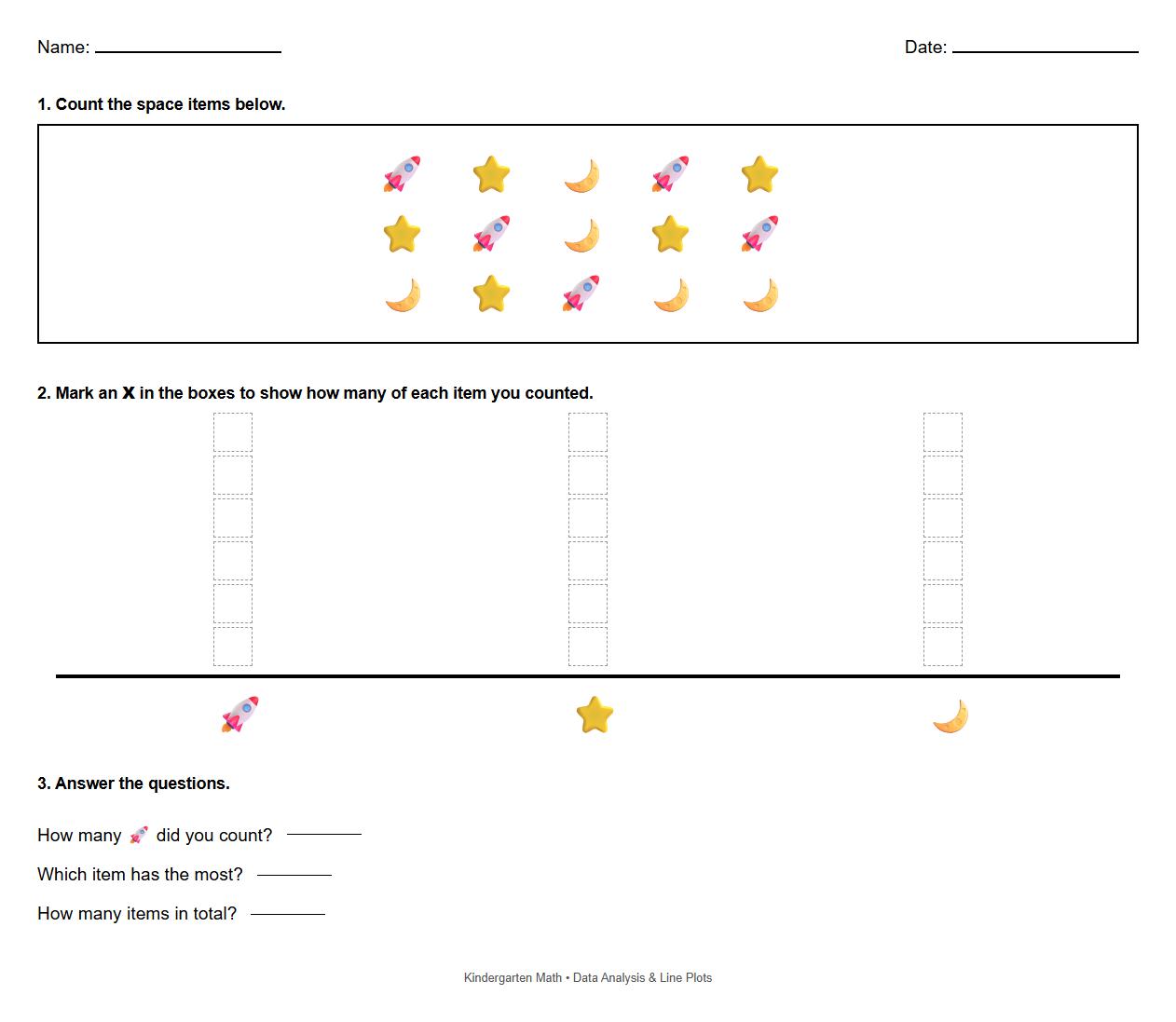
Line Plot Worksheets for Basic Data Analysis

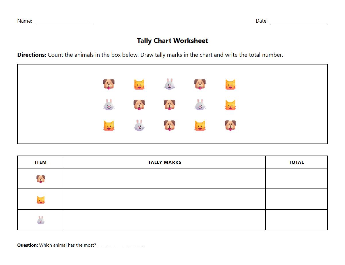
Tally Chart Worksheets for Data Collection Practice

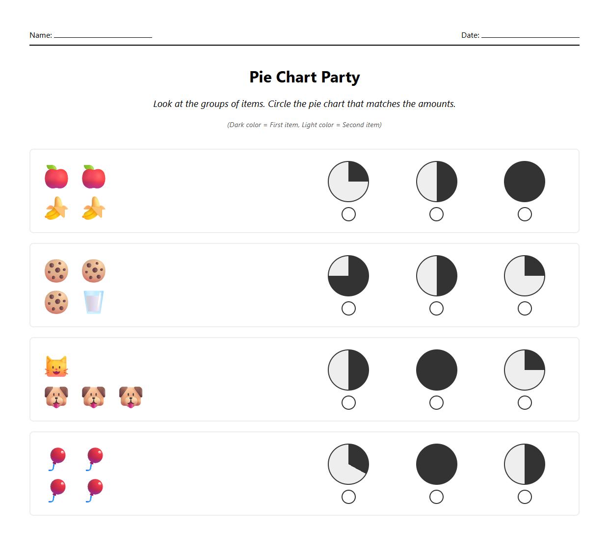
Pie Chart Worksheets for Visual Proportion Understanding

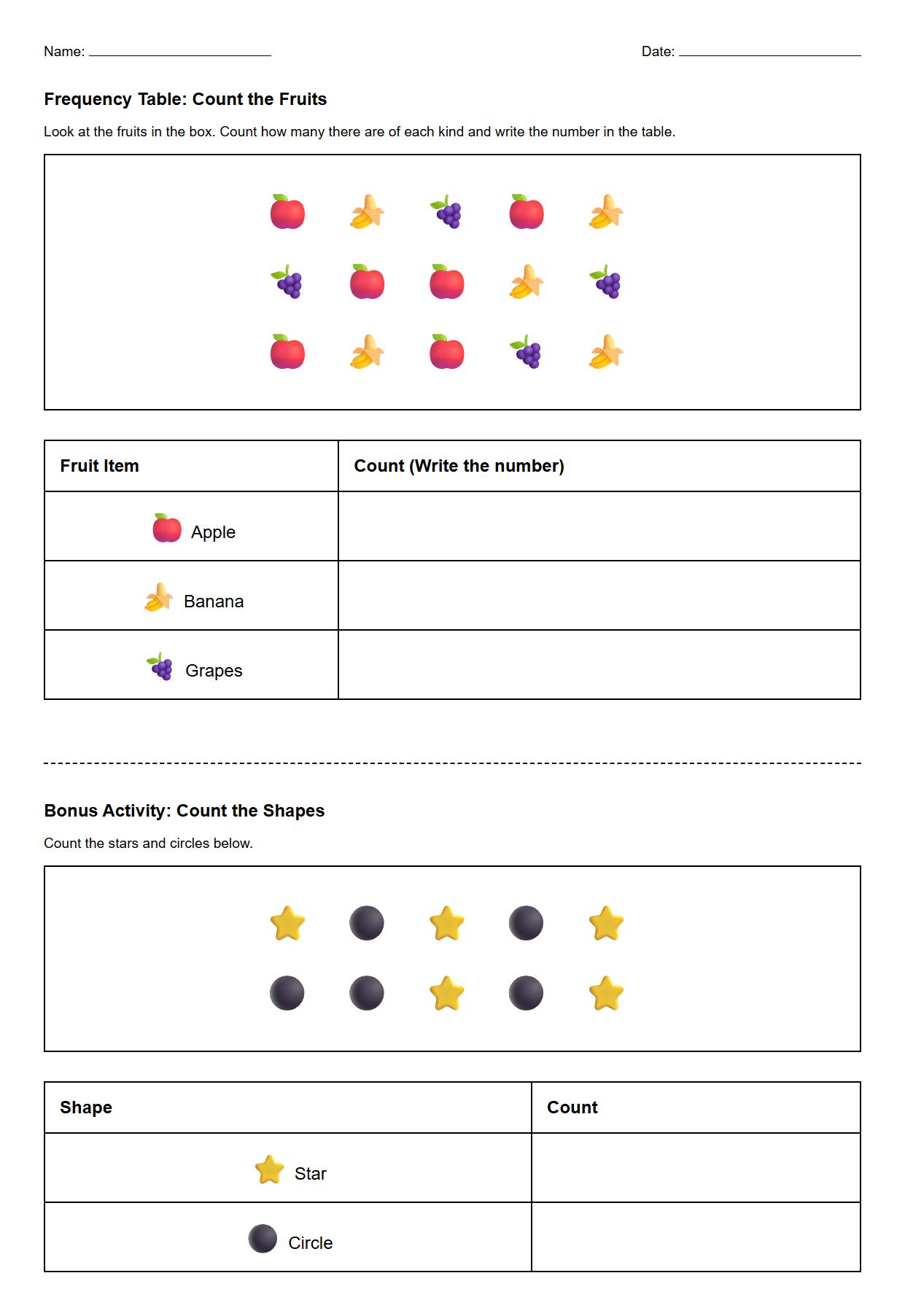
Frequency Table Worksheets for Simple Statistical Counting

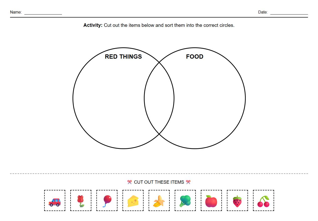
Venn Diagram Worksheets for Data Sorting

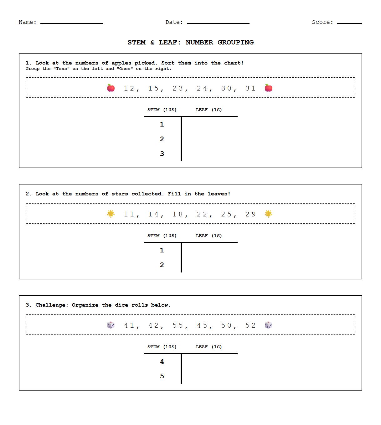
Stem and Leaf Plot Worksheets for Numerical Data Grouping

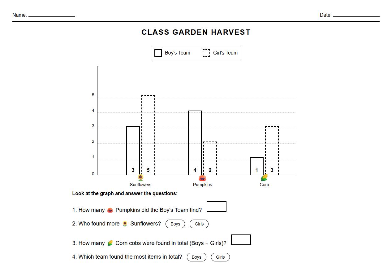
Double Bar Graph Worksheets for Data Comparison

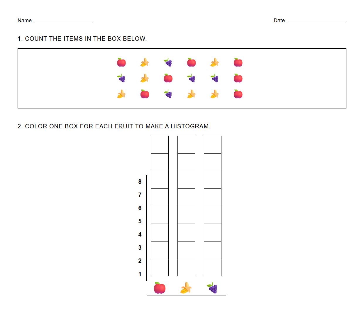
Histogram Worksheets for Quantitative Data Distribution

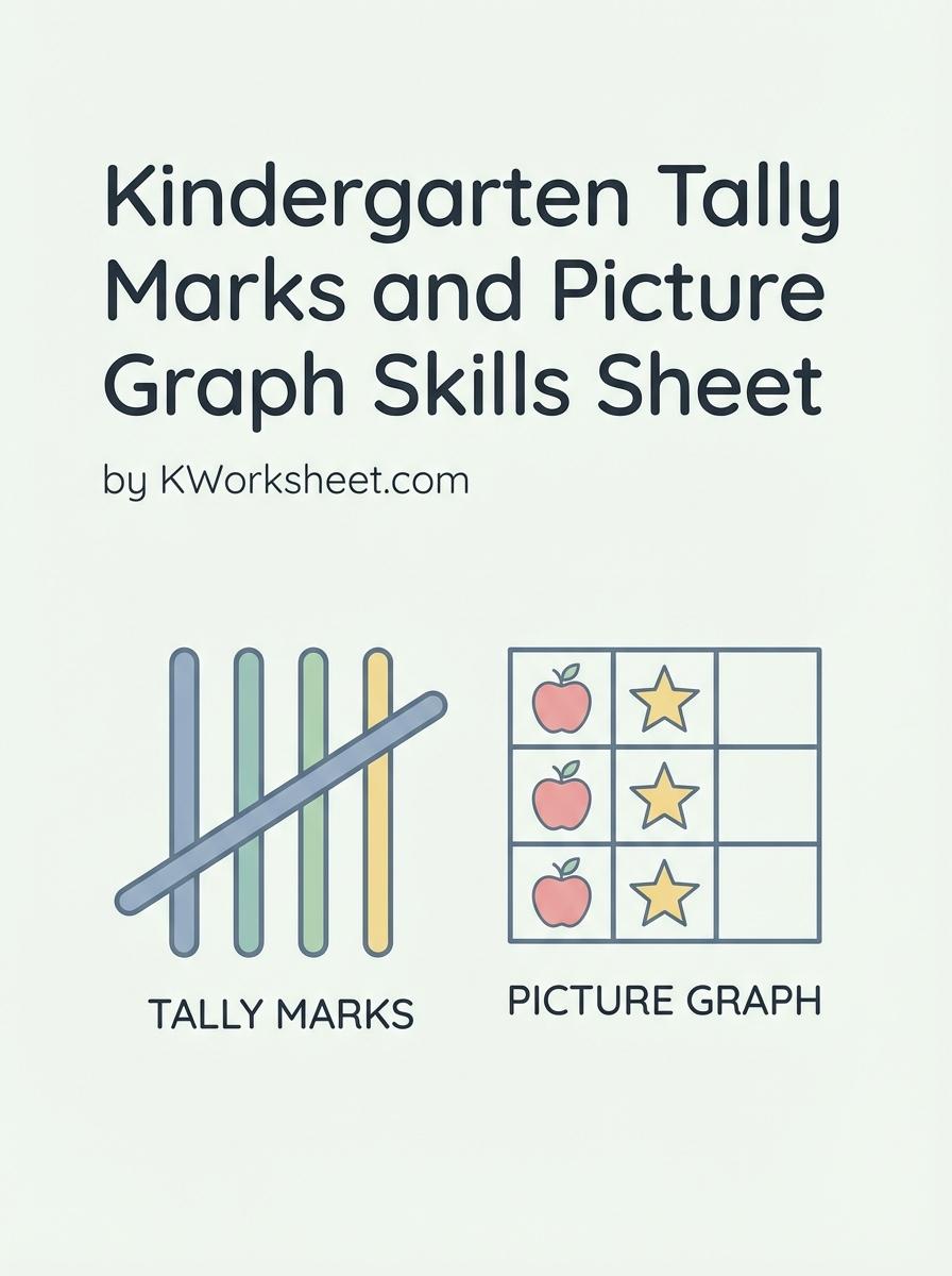 Kindergarten Tally Marks and Picture Graph Skills Sheet