
Kindergarten graphing worksheets enhance early math skills by teaching children how to organize and interpret data visually. These activities develop critical thinking and pattern recognition through simple charts and graphs tailored for young learners. Explore our collection of engaging worksheets to support your child's math foundation.
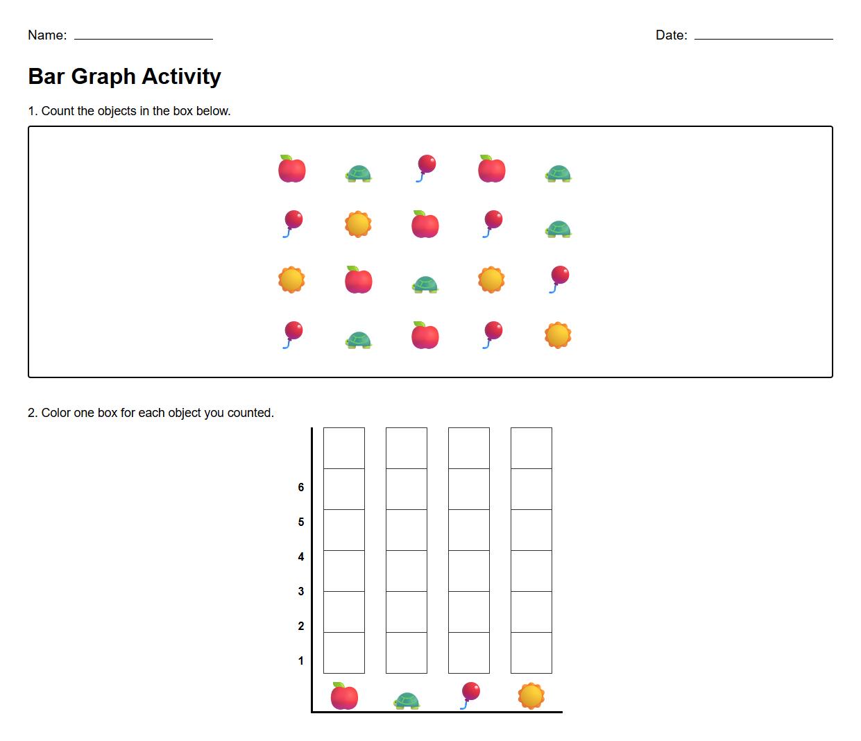
Bar Graph Worksheet for Counting Objects


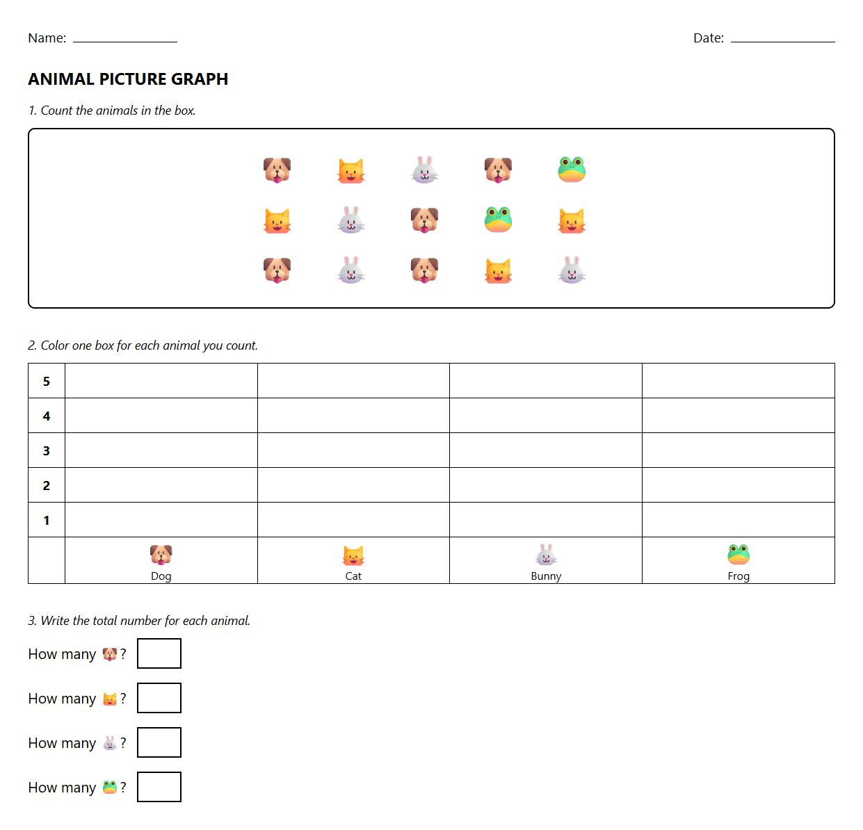
Picture Graph Worksheet with Animal Themes

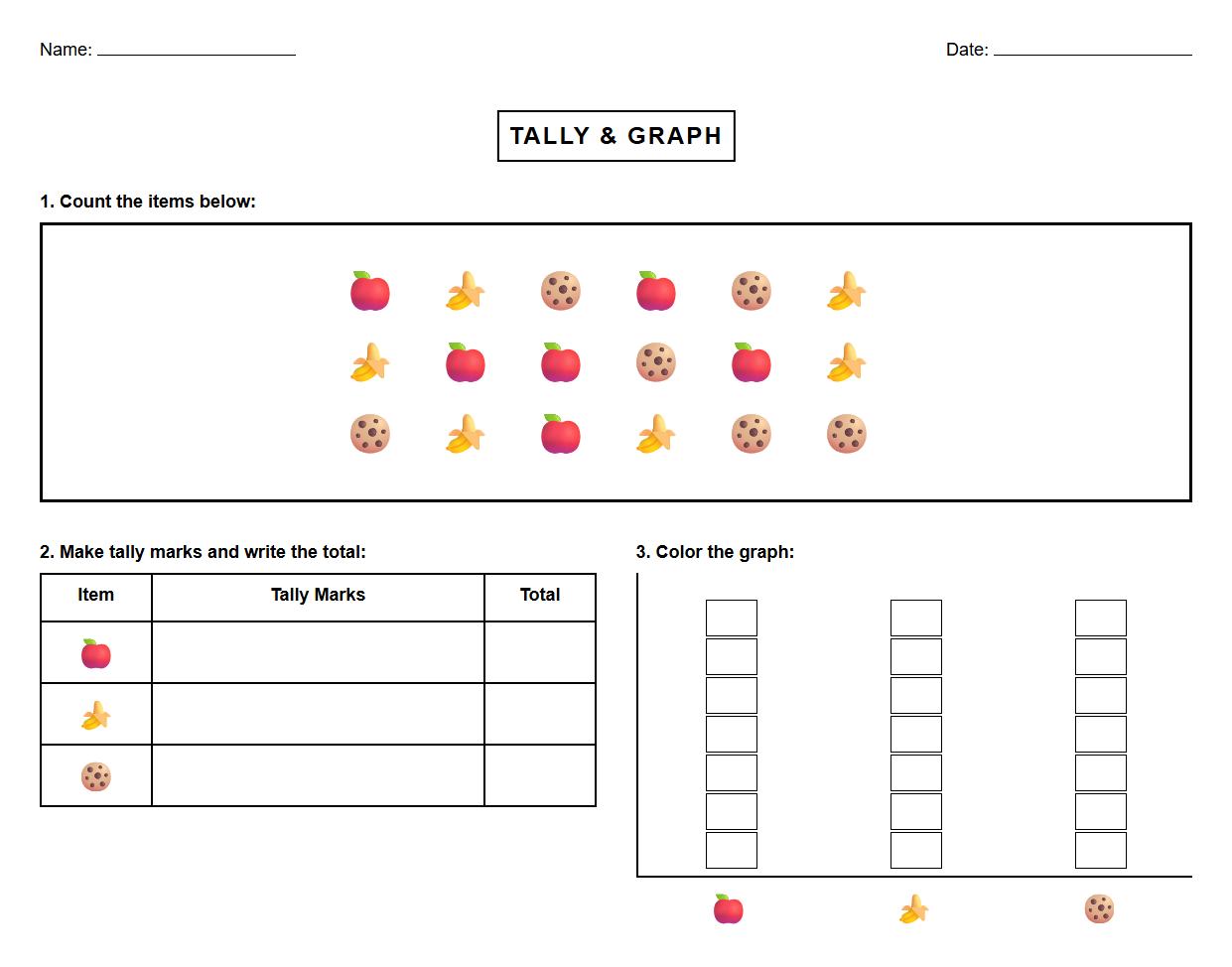
Tally Mark and Graphing Practice Sheet

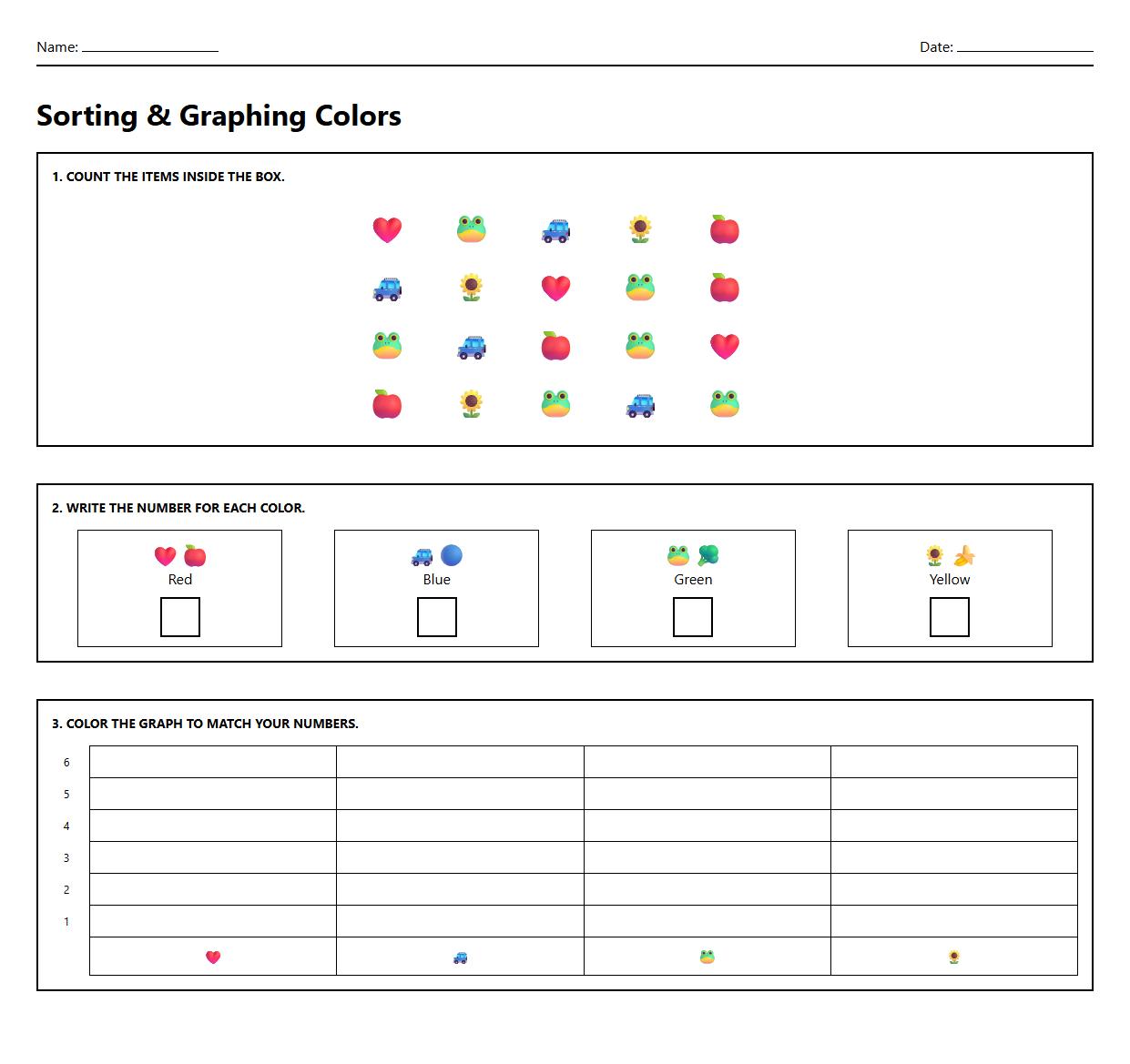
Sorting and Graphing Colors Activity Worksheet

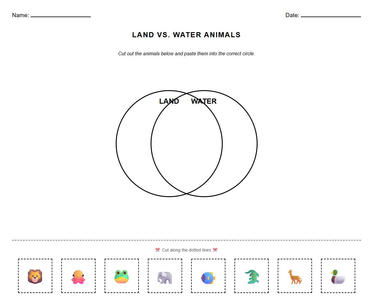
Interactive Venn Diagram Worksheet

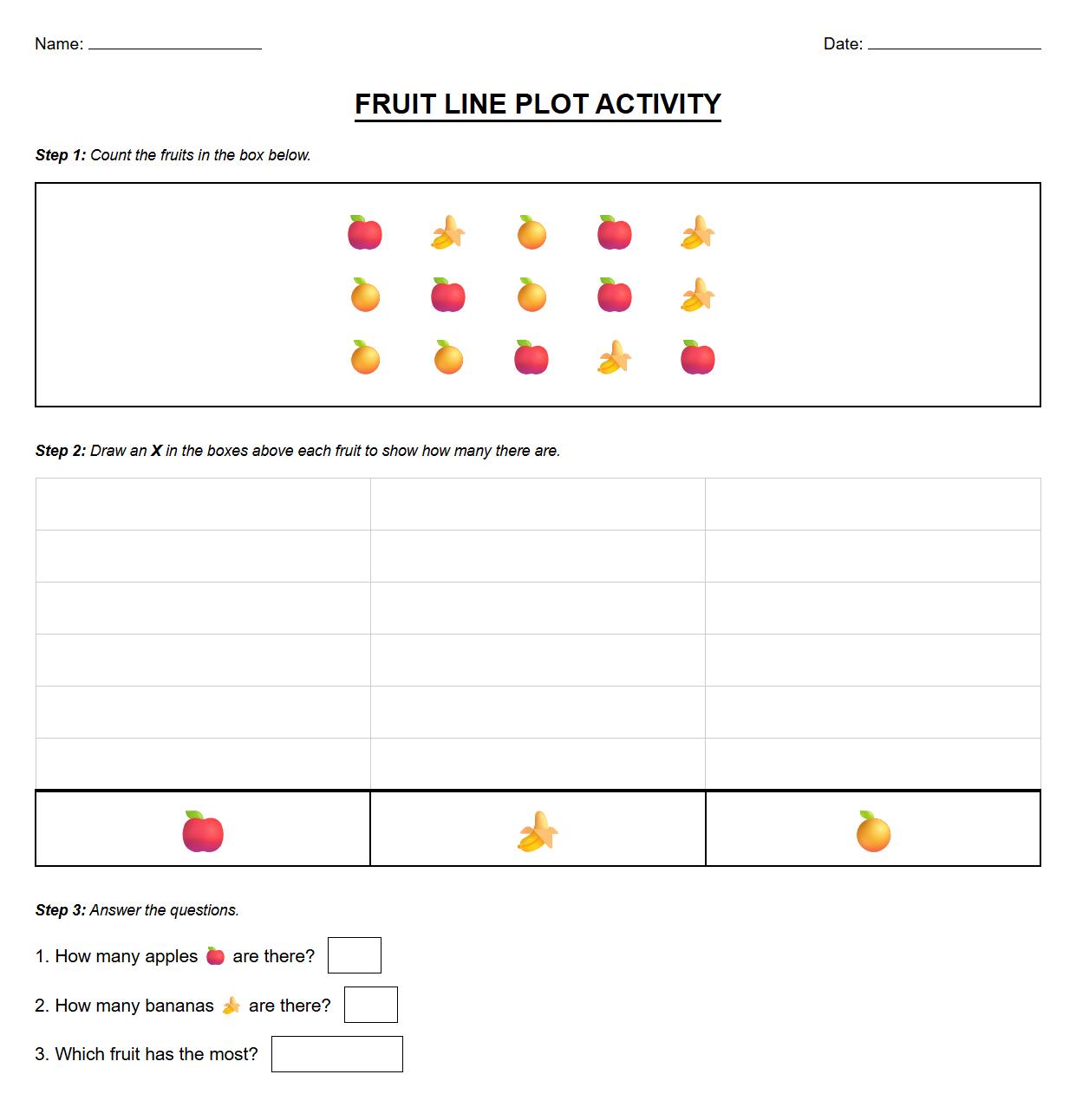
Line Plot Worksheet with Simple Data Sets

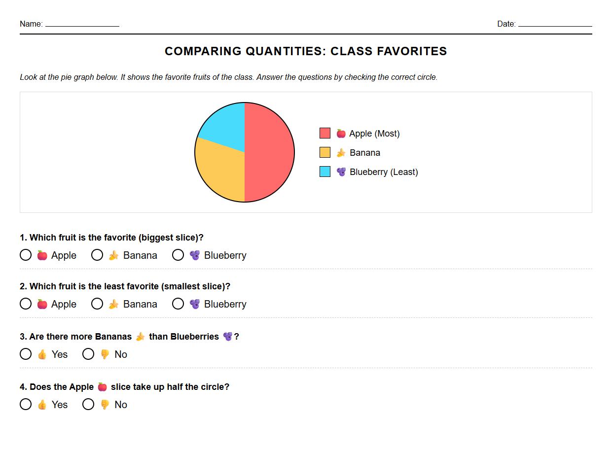
Comparing Quantities with Pie Graph Worksheet

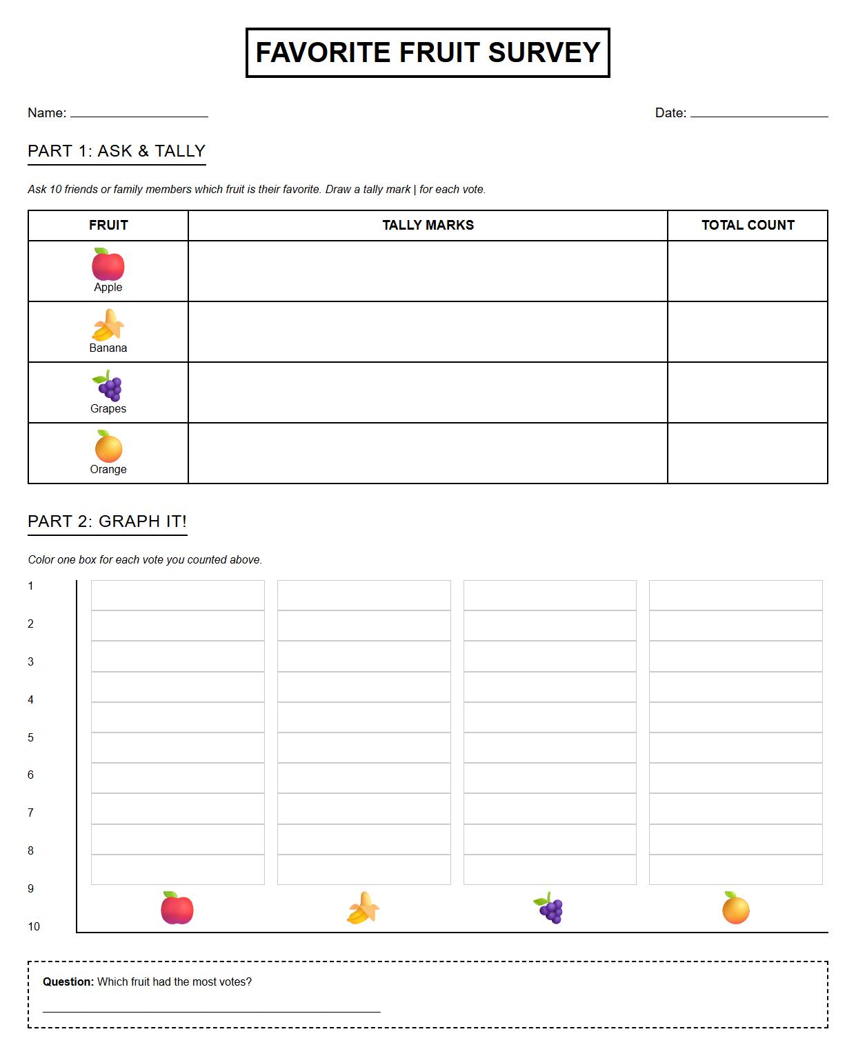
Favorite Fruit Survey and Graphing Sheet

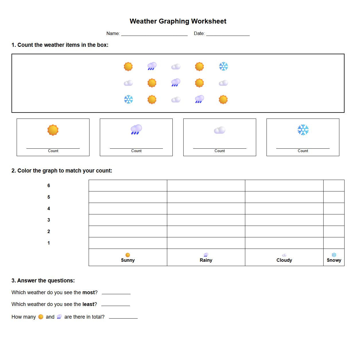
Weather Chart Graphing Worksheet

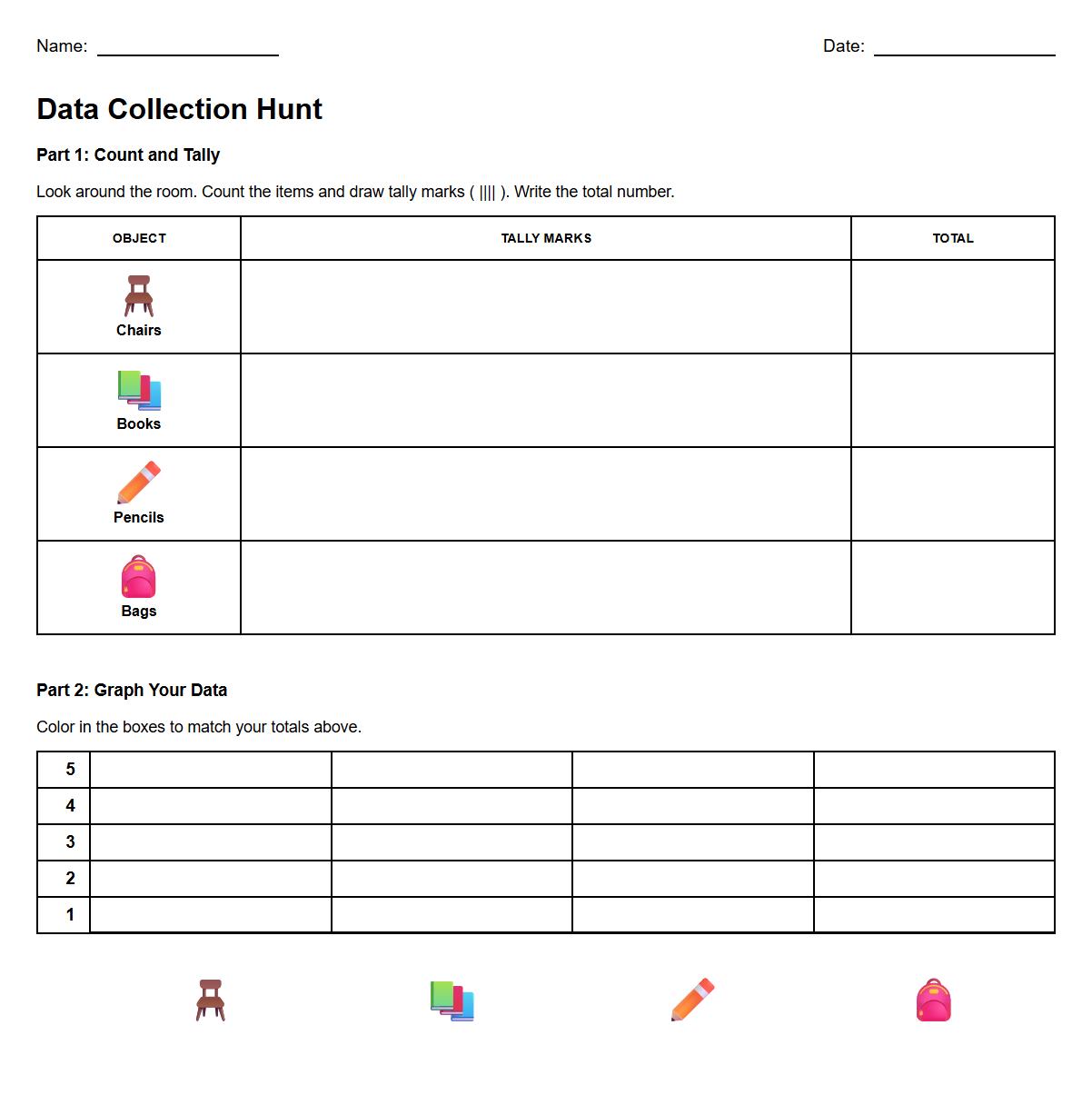
Real Life Data Collection and Graphing Worksheet

 Fun Tally Marks Worksheet for Kindergarten Math Practice